Logos, as we all know are the visual representation of a brand. They not just help in creating a brand identity but also in etching a mark in the hearts of its users. Although logos are considered to give a consistent brand image to the company, many companies believe that logos need to be updated from time to time in order to stay strong in the game of online identity. The leading example of this continuous logo changing trend is Google.
Google, the search engine giant, has always been tweaking its logo since the day it was first launched in 1997. No doubts, the wordmark has remained constant, but the style, font, color, and typeface have been experiencing a continuous change. A look through the evolution of Google logo and you would realize that it has indeed experienced numerous redesigns, tweaks, and overhauls to reach the simplistic wordmark that we so clearly identify today. Let's have a look at the Google logo evolution to understand what kind of changes it performed and take a cue from it to make desired tweaking in our company logo.
Google Logo: 1997
At the servers of Stanford University, in the year 1997, Google's humble beginning was started with this blurry Google logo. During this time, the Google's servers were just starting to take shape and the same can be reflected in this first ever logo made by Google as well. The words are blurry and the color scheme used in this logo is over-filled with the tone of red.
Google Logo:1998
A few months after the first blurry and unshaped logo released by Google, the first original Google logo was launched. This logo created by Sergey Brin was much sharper, simpler and clear. The fonts used in this logo were Baskerville Bold. However simple and precise this logo had been, it couldn't survive for more than a month.
Google Logo:1998
After a month of the previous logo, Google released its third logo with a bit of color tweaking and font change. This time Google played with colors and even added the unique exclamation mark at the end. The shadow effect in the logo was increased and the letters were seen as more rounded in this logo. This color sequence with a blue G instead of green is still seen in the current version as well, only the hue and the font have changed.
Google Logo (Concepts): 1999
A number of Google logo concepts were brought forward in the year 1999. From the infinite connection mark, target allusion, and interlocking Os design to magnifying glass, playful smile and freedom from overt search connotations, a number of logo concepts were seen in this year. A number of logo designing companies tried to.
Google Logo:1999
In May 1999, Google came up with yet another logo with continued to work for more than 10 years. Instead of the clich'd Times New Roman font, this logo saw the use of Catull font. This logo remained to be the visualization of Google from May 31, 1999, to May 5, 2010. The visual description of this logo can be best expressed in the words of Kedar, the designer of this changed Google logo, The texture and shading of each letter is done in an unobtrusive way resulting in lifting it from the page while giving it both weight and lightness. It is solid but there is also an ethereal quality to it.
Google Logo:2010
On May 6, 2010, Google updated its logo after a gap of more than a decade. The projected shadow was at a reduced distance in this new logo. The yellowish hue of the second in Google was made a few points lighter. The letters were made a bit more flattened than the rounded alphabets in the previous one.
Google Logo:2013
As 2013 dawned, the smart heads at Google decided to change the Google logo again. It was an even flattened designed that its predecessors which enhanced the colors of the letters. The shadow effect was completely removed in this logo. It was released on September 19, 2013, and appeared as the Google symbol till August 31, 2015. This logo was easier to read on the smaller screen size and the reason could be the increase in mobile searches during this time.
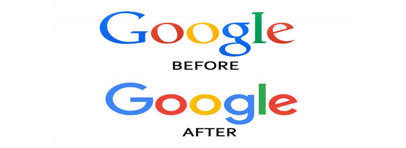
Google Logo:2015
The latest logo of Google was introduced on September 1, 2015, and continues to be used as a Google symbol even now. This logo has a sans-serif font that makes it look a lot more modern and elegant. This is the biggest change the Google logo has undergone since 1999 change. The font has been completely changed, there is no shadow effect, and the design is more flattened.
One lesson taught here from the search giant Google is that no matter how big or small your company is, the logo should constantly be updated to meet the present needs. While many of you may have playfully searched how to change the Google logo to my name and tried to have fun while seeing your name in the logo, the expert heads at Google have consistently worked on their logo to stay ahead in the game. So, don't satisfy yourself with just one logo, get creative and understand the modern trends to redesign your logo to have a strong brand identity. Get the best logo designers for your company and leave a mark in your users' minds with simple yet effective logos.
1 thoughts on "Google Proves That Logos Need Regular Update"
seo webdesign houston
15 September, 2017 at 12:43 pm
Wonderful blog & good post.Its really helpful for me, awaiting for more new post. Keep Blogging!
Cancel
Reply