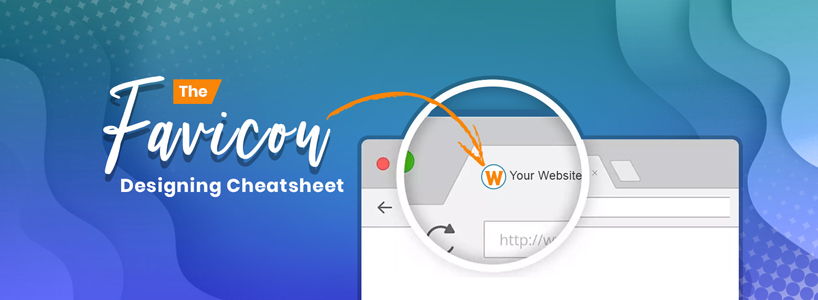
Ever seen a favicon? No? Hang on, you every day see favicons, not one but many. If you don't know what a favicon is, we'll introduce it to you. Whenever you open a webpage, the small icon appearing on the top left side is called a favicon. The browser tab, bookmarks, toolbar, and recently visited tab are the places where favicon can be seen. In the simplest words, a favicon is like an identity card for a website. Though small in size, a favicon has a significant impact on the website. It serves as the identity of the brand.
Most of the companies use their brand logos as the favicon. Google, Facebook, WhatsApp, Wikipedia, Apple, Android, etc., are some renowned names that use their logo as favicon. Moreover, the list is endless. Considering this trend, many web designers are including the brand logo incorporates web designs as the favicon. The prominent reasons behind the inclusion are authenticity & credibility, brand recognition, and helps in located the website after bookmarking.
Now, conceiving this little representative of a website can be cumbersome because there are several factors behind it. Whether it is a corporate web design or personal, a favicon plays a key role in dropping an impact. To put things at ease, we'll be unfolding the cheatsheet that comprises some amazing tips for designing the perfect favicon.
Favicon Design Rules
Let's kick off with the designing rules and understand them.
- Create 2 Versions
The key factor that cannot be ignored is browser and functionalities. Sometimes, web designers skip browser consideration while crafting the favicon. Hence, experts recommend creating 2 versions of the favicon. Since they are used in multiple display contexts, you cannot assume how they will be displayed on the user-end screen. The 2 favicon versions should be as follows:
- Transparent background- This version of the favicon is displayed in the URL bar next to the name of the website.
- Solid Fill- This version is used in shortcut menus where the browser masks the URL bar.
- Clarity & Conciseness
No identity card in this world has a photo with filters and decorative stickers. Similarly, the favicon should be clear. It shouldn't be embellished at all because it is not designed with the motive of marketing. A favicon should be conceived using minimal decoration. No unreadable text or photo should be the favicon. Just use a simple logo and you're done. Here, most of the designers lay a strong emphasis on the color scheme. In a corporate setup, a bright & blingy favicon will be downgraded as it may not go well with the brand's identity. Thus, the brand favicon should have the right aesthetics that match the identity of the brand.
- Iconic & Classy
Ever seen the favicons used by automobile giants like BMW, Bugatti, Lamborghini, Ferrari, and Mercedes? Their favicons speak volumes. Such high brands prefer simplicity because their logos are wordmark and brandmark. Even if the text is dropped out, the pictorial representation will still have an impactful retention value. Hence, web designers need to identify such elements in the logo and make a favicon that does not compromise the brand identity.
- The Right Size
Requirements while crafting web favicons remain different in all contexts. There are different reasons for it. Although saving the favicon design in PNG format is approved on a huge scale by experts, some belief in the ICO format. The benefit of saving the favicon under ICO format is that a web designer can create multiple favicons of various sizes in a single file! The universal size of the favicon is 16x16 pixels, but it can be 32x32 or 48x48 pixels too. Reason-users may drag the bookmark to the desktop. If the favicon stands on 16x16 pixels, it might appear distorted. Hence, the 32x32 ad 48x48 pixels version would prevent distortion.
- Sketch em
Before unveiling the final version of the favicon, you must sketch it out to eliminate the skeptical ideas loitering inside the head. Sketching the favicon liberates the designer in finding flaws and making the desired changes easily. Many I.T industry mavens highlight the importance of sketching the favicon because replicating the exact design turns out to be a cakewalk after achieving the final basic outline.
- Stay Consistent
While creating a favicon, make sure that it complements the brand identity and creates a synergy in the customer's mind about the brand & its products/services. A first-time visitor on the website should be able to comprehend the favicon and the products offered by the brand. Creativity is essential for crafting the right aesthetics of the favicon but it shouldn't blindfold the designer. An empty beer bottle would still fit better on a brewery website instead of a nightclub.
- The Monochrome Experiment
"Even if I do not add colors to the favicon, will it be presentable?" Definitely! Experimenting in a channelized manner never backfires. If you have the right image in the head, just craft it down on paper. All you need to assure is the clarity of the message & brand aesthetics. If you believe that the absence of colors won't affect much, go on with the monochrome favicon.
Whether it's a graphic designer or web developer, skipping the need for creating an impactful website favicon is guaranteed. However, the new generation designers & developers are quite considerate & give attention to details. A favicon is like having an identity card because people & websites with ID cards are considered professionally credible.