A great contact page is the most crucial page of any website owing to its role in getting in touch with potential customers as well as for the collection of their essential data to seal the deal with personalized marketing. Being the one place where the user is directly coming to connect with you; it is indispensable that this page is designed with utmost precision and expertise. A well-thought design of contact page results in a successful contact form, which converts passive users into active ones, persuade them to feed their details and successfully collect the data. There's a very thin line that distinguishes a converting contact page from a non-converting one. It is the page design and the little details you add that make all the difference. To help you out, we have cumulated the secret ingredients of a successful contact page along with some design approaches which will definitely increase your contact form conversion rate.
Secrets Of A Successful Contact Page
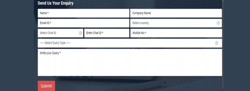
- Remove Irrelevant Fields Having too many fields in the contact form can easily overwhelm any user. A report by Hubspot confirms that a contact page with fewer contact fields leads to higher conversion rate. A good contact form, according to various reports, has maximum 4 fields. So, get rid of those irrelevant fields to save time and get the user to start filling up now.
- Give Them A Reason To Contact An inviting and welcoming contact form that tells the users what they can get after contacting you is a game winner. The contact form should also give other helpful details like the time for follow up, the person following up or how they would benefit from by typing their precious information in the respective fields.
- Leverage The Power Of Social Media Social media has become an important tool for people to trust a particular person or brand. Giving social proof in your contact form by talking about your reach, active members, and testimonials is a sure shot way to increase your conversion rates. Moreover, you can also add your social media profile buttons as an alternate means to contact you.
- Brand The Page Don't create a completely outlandish contact page that does not reflect your brand image. Use the same color palette and font with a strong and bold image on the contact page to build a professionally designed page. Make it attractive and intuitive but not with loud colors and funky text font. Ensure that your brand image is reflected through the contact page.
- Choose The Right Color For CTA The CTA at the end of the contact form plays an important role in driving the user to fill the form or dragging them away from it. The color of the CTA should go with the entire page but at the same time it should also scream Click Me. An additional tip for the CTA is to use a catchy and effective Click Here button instead of a Submit button at the end of the contact page to get your conversion rate up by 25%-30%.
- Personalized Form Submission Message Many designers leave the contact page after adding the necessary design elements and forget to design a successful form submission message at the end. A personalized Thank You message is a must have in every contact page. The message should also talk about the time in which the user would be contacted regarding the query they have submitted.
Design-Oriented Approaches For Your Contact Page
- Animated Multi-Step Approach A multi-step contact form is an ideal approach to get your users into filling their information on the page. Adding animations for this multi-step form makes it even more engaging. As the user has to fill in single information at a time, it seems less demanding. Using a multi-step form instead of a traditional contact page design can boost your conversion rate by 300%.
- Categorized Approach Categorize your contact page format for the different types of queries that the user can have regarding your website. A website offering a number of services and solutions should consider this approach where the user is directed to a relevant contact page as per his/her needs. Scribd is the best example of this design approach. It has creatively used card design on the contact page to help redirect the user for various issues like I need help! Im a publisher! I just wanted to say hi! etc., to organize the page and avoid overcrowding.
- Minimal Approach A minimal design approach is an evergreen trend in the contact page form. A page with a uniformly dark yet personalized background color and standing out contact fields is a sure way to soothe the mind of the user and encourage him/her to enter his/her information. Keep it simple with just 3-4 contact fields asking for name, email id and a message with an effective CTA at the end.
- Full-Screen Approach Another way to convert the user and get their information on the contact page is by using a full-screen contact page approach. As soon as the user clicks on the contact form, the full-screen contact question pops up. It is a combination of multi-step and no-contact page approach where the user gets a pop up right by clicking the contact button. It prevents the user from getting distracted by the additional information present on the page and increases the conversion rate.
- The Footer Approach This is an effective design approach that makes the contact form appear at the footer of every page of the website. Placing the contact page with just 3-4 fields of information and an effective CTA can increase conversion by manifolds. All your pages become contact pages and the user can inquire about anything just by scrolling down without having to click on a separate button and land on a contact page to fill information.
A successful online business starts with the creation of your website and continues to grow as more and more users get converted by filling in the contact form. Therefore, it is indispensable that you have a compelling contact form to engage more and more users and increase your brand community. The design approaches and the ingredients discussed above would help you create a successfully converting contact form.