 +91-9811948545
 Get a Call Back
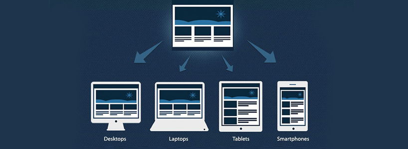
Like water, that takes the shape of the container that it is poured in, your website content should also fit any screen resolution that it is viewed on. Whether your website is viewed on a desktop, a mobile, a tablet, a phablet or an iPad, it is deemed as a flawlessly responsive web design only if it exhibits the water-like fluidity to fit any screen. There's no negating the fact that effective responsiveness to multi-screens is an inescapable part of your web designing in the current online landscape and an unresponsive website would only mean you missing out on the skyrocketing mobile traffic. However, this is not the sole reason why you need to have a responsive website, there are many more. And in this blog, I have put together the most important ones. So, let's not waste time and see why a responsive website is the need of the hour in 2017 and further look into some of the best practices to design a responsive website.
Need For Responsive Web Design
- Unparalleled User Experience
The internet user has become tech-savvy and uses various devices to complete a single task. While he/she may use the desktop for searching a particular thing, mobiles may be his/her go-to partner in deep researching. The user today switches between different devices and wants seamless switching from the website too. He/she desires a flawless browsing experience on whichever device they use. A responsive web design caters to this need of the user and offers an unparalleled user experience on various screen size.
- Higher Ranking
Every website wants the top spot on the first search engine result page and invests time and money just for that higher visibility. The search engine giant, Google, released its algorithm update for the responsive website in 2012 and gives higher ranking to responsive websites over those that haven't embraced responsiveness. A responsive website enables the spiders to crawl easily through a single URL as opposed to the multi URL approach for individual mobile and desktop websites.
- Boosts Page Load Speed
In an age when more than 50% of the users want the website to load in less than 2 seconds and would abandon a page if it does not load within 3 seconds, page load speed has become a crucial factor in increased user-engagement. A responsive web design is one of the best practices for boosting the page load speed. Having a responsive page design would make the pages load quickly on various screen sizes and reduce your bounce rate.
- Ease In Functioning
Creating a responsive website is way easier than investing resources in a dedicated website for mobiles. You not only save both time and money, if you opt for a responsive web design, but also get the benefit of ease in functioning. A responsive website does not require separate HTML codes for different screens and their resolutions. The same URL works in every device and no changes are made in the URL while switching between devices. Moreover, you can also access the analytics for measuring the success of your website from a single place instead of using individual analytics for different devices.
Best Practices For Responsive Web Design
- Responsive Typography
The value proposition that you have to offer on your website should be readable for users to stick around. Responsive typography ensures that your text is optimized for readability across various devices. The font of the headline and body should be balanced to fit the screen resolution. The characters used in a single line of content for a responsive website should be limited to around 50-65 characters. The HTML font size should be set at 100% for quick readability across devices. Margin bottoms can also be set same as your line height against the content blocks to maintain a vertical rhythm on the text of your responsive website.
- Standardized Buttons
There's a huge difference between the way a user clicks on various buttons on a desktop and on the mobile. While mouse clicks are used on desktops, mobiles require the user to user finger/thumb touch for clicking any button or call. The CTA buttons require a larger interactive area in a responsive website. According to a study of Human Fingertips to Investigate the Mechanics of Tactile Sense, the touch target of every button should be around 45-57 pixels. This reduces the number of errors made while clicking a certain button, thus improving the user interface.
- Scalable Vector Graphics
If your website has any type of illustrations like icon or graphic in its design, then having Scalable Vector Graphics is a must for your website to be flawlessly responsive. Owing to their infinitely scalable nature, SVGs ensure ultra-sharp graphics on every device or screen resolution. Unlike jpg/png images, these SVGs have a very small size and reduce the page load time to boost user engagement.
- Image Responsiveness
Images are the biggest concern of websites when it comes to creating a responsive web design. There is a world of difference between the size of an image on a desktop and that on the mobile. While you may require an image size of 1,200 pixels on a desktop, the same image may shirk down by a third to just 400 pixels on mobiles. Here we would not go by the slow old school formula of calling the same sized image for both the devices. To boost the site speed, you need to have two separate versions of an image for the different devices. You can change the source order code for calling images and set them at the different size for different devices. This way of calling up two separate sized images ensures that your images load quickly on the mobile page and that too without any pixelated image.
These principles of responsive web designing may be a left-hand trick for the astute web designers, but to others, it may seem just like a technical mumbo-jumbo. That's the reason why professional web designers and web designing companies exist- to help you out in every way possible. You can join hands with an experienced web designer or take the web designing service from a top IT company to discuss these principles and get a more responsive website in 2017.
1 thoughts on "The Need For A Responsive Web Design And How To Do It Right In 2017"
Web Design Bhopal
27 October, 2017 at 9:08 am
Thank you for sharing this informative blog as it will help us to get a more responsive website that will grab the attention of people. Keep sharing.
Cancel
Reply