 +91-9811948545
 Get a Call Back
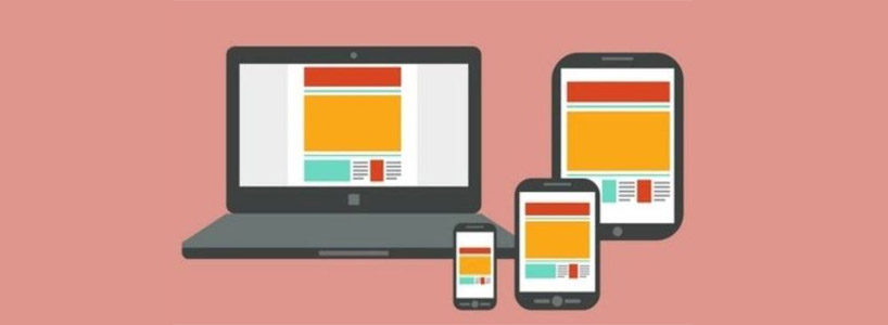
Online promotion has proven itself extremely beneficial for the success of any business or company. With the growth in mobile technology, online promotion is not limited to desktops and laptops anymore. Websites are now accessed on several mobile devices right from various smartphones to tablets. And this has led to the development and use of Mobile-Ready Responsive Web Designs. Presently, Web Designing in India includes innovative solutions for Mobile-Ready Responsive Web Design for different types of businesses. So, here is a little overview on what basically is a Mobile-Ready Responsive Design is and its benefits:
What Is A Mobile-Ready Responsive Design?
Mobile-Ready Responsive Design refers to a concept that facilitates efficient working of a website on different mobile devices. The websites with Mobile-Ready Responsive Design can be viewed the same in tablets and smartphones as they are accessed using laptops and desktops. A Mobile-Ready Responsive website is made by measuring the size of the browser and not the width of the actual screen. It looks the same on a smartphone or tablet like the way it appears when the browser in a laptop or desktop is resized. The most common set parameters of browsers are for a portrait smartphone, a landscape smartphone, a landscape tablet, a portrait tablet, a large desktop or TV screen and a laptop or small desktop.
Benefits Of Mobile-Ready Responsive Web Design
- Complete And Consistent User Experience: The content on the Responsive Design Website used on a mobile device is similar to that of the desktop version. Users, therefore, can get full access to the information by using their mobiles. All the content remains the same whether accessed via smartphone, tablet, or desktop. The difference only lies in the formatting patterns.
- Flexible Solution: The Responsive Design gets adjusted as per the options set in the device such as orientation (landscape or portrait) and screen size (large or small). This makes it a very flexible web solution.
- Reduced Development Costs: With the huge gamut of mobile devices available in the market, creating separate websites or apps for every device can prove to be extremely costly. Using the Mobile-Ready Responsive Web Design, only one website with different formats can solve the purpose.
- Easy Maintenance: As one set of content is used in the responsive design website, there is no need to update a number of different sites. Updating one site is enough for the Mobile-Ready Responsive Web Design to display the same information everywhere.
- Future-Ready: Mobile-Ready Responsive Web Design is a forward-thinking technology. Once programmed, it remains functional for a long time. This in turn can bring better returns on the investment.
- Link Equity And Domain Protection: For making a Responsive Web Design, only new codes are embedded in the existing website. This preserves the link equity and protects the domain by maintaining a canonical URL and evading complicated redirects.
With constant improvements and innovations introduced in the Responsive Design technology, it is surely becoming one of the pre-requisites for a successful online marketing.