Do you know that the design of the website can manipulate conversion rates! Yes, that's a statement asserted by the mavens of the web designing and development industry. A strong SEO game, marketing done right, impeccable content, outstanding graphics, and a website design that serves its purpose are the elements that atomize conversion rate. However, more than 45% of conversion rate success depends on the website design. In simpler terms, your website's face value matters a lot.
If you wish that your website should drive more traffic, stringent website development solutions are the prime requirement of the hour! The right color scheme, an appropriate website frame, responsiveness, and a couple of more website design principles are sufficient to increase the conversion rate. Now, most people think about why this stuff is essential for drawing more conversion rates? The simple answer to the question is presented. In the digital world, presentation matters the most. The way you're feeding your subscribers, either content or information is the game-changer.
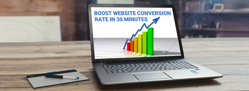
In this write-up, we'll be discussing some game-changer tips that should be included in the website design. These tips are a sure-shot solution to drive more conversion rates to the website.
- The Full-Screen Door Mat
Welcoming the onsite visitors is always essential because Guest is equivalent to God, as per a famous Indian proverb. A marv and full-screen welcome page can do its part on time. You just require placing a CTA button on this page, nothing else! There'll be no other distractions and the home page will remain intact. Not only this but the user activity will also be engaged for long as they need to click the CTA for further results, hence it will reduce the bounce rate. By limiting the user choices, the website becomes easy to use.
- The Magical Rule of 3rds
The rule of thirds is a popular rule in photography and widely used in web designing too. Using this as a design principle, it becomes easy to divide the webpage with uniformity whether vertically or horizontally. The four points that intersect in the middle are the crux of the matter. When objects are placed in the middle of these boxes, a flawless and impactful image is created as per the rule. The prime concern for applying this rule is to boost the conversion. Website designers worship this rule and apply it on a majority of websites because it helps to assemble the visitor's focus at the CTA button.
- White is A Sign of Positivity
Gone are the days when designers considered the white space on a website as a jinx. Usually, the white, or negative space, is the place anywhere on the webpage that remains empty. It can be anywhere like at the header, footer, sidebar, between the paragraphs, etc. It can be managed easily by paying attention to the smaller places. What to do? Here are some quick tips:
- Use small font because it alleviates the white space. The line height for the font should be 150% (below and above the text line)
- Break a single paragraph into multiple paragraphs. This will cover up the minute white space and make the content more readable
- The Effing F Layout
As per the web designing experts and mavens, it is observed that a user goes through the text of the website in the F pattern. This is indeed a great observation and related to the conversion rate of the website, but how? It is as simple as drinking water. Since the secret is disclosed, you now require to place the CTA in the F-shaped area. This will catch the attention of the visitor instead of ignoring it. Similarly, one can place the posts that you want to be read by the visitor that will be an apprentice in boosting the website conversion rate.
- Right Color Scheme
By choosing the right color scheme, designers can make a website impactful. Previously, the color scheme was underrated but in the last few years, designers have considered its importance because it is connected with the emotion it conveys. Most of the restaurant websites and food applications include colors like yellow and red because they trigger appetite. Besides, they're easily visible even with a dark background. Color contrast also plays a key role in selecting the right color scheme. The text on every webpage, CTA, headlines, etc., should be readable. Here's a bonus tip- use a different color for the subscribe button that makes it stand out from the whole webpage.
- The K.I.S.S Module
- The Keep-It-Short-(and)-Simple, or K.I.S.S is the ignorant module in website designing. Aesthetics of the website matter to drive conversions because presentation matters, however, when the website isn't easy to scroll, it won't get any conversions. A web designer should question himself/herself about website aesthetics and smooth navigation. So, instead of cramming too much on the same page, follow the K.I.S.S module wisely and you'll easily conceive an aesthetically designed easy-to-operate website. Here's a perfect example-
- Take a glance at the website of the celebrated vehicle brand Lamborghini. It carries strong aesthetics, utilizes the white space flawlessly, and is adorned with the rule of thirds aptly! The simplicity in the navigation bar makes it easy for visitors to read the text.
- The Value of Faces
As per many website designers and some case studies, the inclusion of human faces never puts a website visitor into a dilemma. The familiarity with the emotion conveyed through the website increases when faces are included website. It is a human tendency to feel connected with the brand, perhaps a bit when faces are incorporated. Include photos and place them using the rule of thirds to provide sufficient white space for placing a CTA button.
- The 8 second Rule
Let's get this straight, your website has 8 seconds to leave an impression on the minds of visitors. The attention span of a human is equivalent to a goldfish's memory when they're swirling in the digital world. Anything that catches the attention becomes a preference. Thus, you need to be particular in adding the content along with the aesthetical frame of the website. Check out some quick tips:
- Incorporate crispily and to the point headlines
- Catchy imagery is a must for drawing attention towards the main CTA
- The hover-over effect can uplift your favor
- Animated pop-ups are a plus point
On An Ending Note
And by implying these rules, you can scale an optimized conversion rate in a few weeks! If already applied, you deserve a big round of applause. If you haven't, break them on the website and see the favored conversion. Just ensure that everything hits the bull's eye. Good luck!